Dating Sim Demo, Done Three Ways
The Completely Skippable Preamble
I love cooking. Outside of making and playing games, I would say it’s probably my favorite hobby. When I get off from work, before I start making games, I always cook something, usually while watching a video of someone else cooking something different.
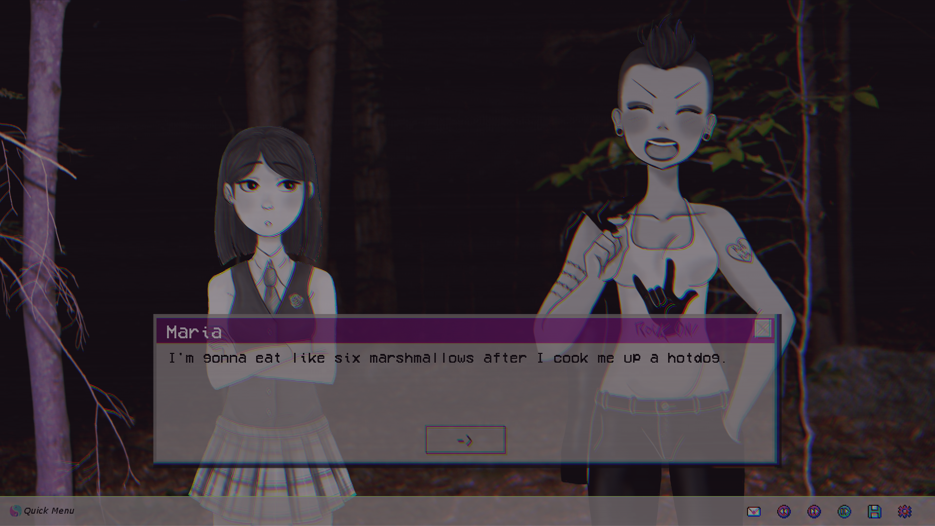
One of very few traits I share with Maria.
As such, I read a lot of recipes, especially ones I find on the internet, leaving the massive pile of recipe books I’ve accumulated over the years mostly untouched. One of my favorite types of recipes is the combo-pack, multiple-recipes-in-one deals you find on a lot of food blogs. The one with a title something like “Baked Beans done three different ways” or “Fifty things you can do with boneless skinless chicken thighs.”
Part of this is due to the simple fact that out brains respond better to articles with huge numbers in the titles. Part of this is because I like to experiment in the kitchen and find that a long list of possibilities with plenty of room to mix and match is preferable to a singular recipe. But part of this is the simple reality that there are a lot of recipes that call for tools I don’t have or techniques I haven’t mastered. I don’t have a Dutch Oven, and I’ve never in my life successfully flipped anything without the help of a spatula, but I do have a crockpot and… a spatula.
That brings me, in an admittedly somewhat roundabout way, to the purpose of this post-mortem. In the process of making the demo for Don’t Take It Personally, I Just Don’t Like You I designed three separate demos over the course of about six months. While only one was ever completed, each one had enough time and effort put into it that I thought they all deserved some kind of examination and post-launch dissection, even if it was just a chance for me to explain what I was thinking when I decided to throw out several months of work and start over. Twice.
I don’t think either of the abandoned projects were bad ideas, I just think that they were poor choices to focus on for this particular project. Each demo had a different purpose and vision for what I wanted to communicate about the project to the player, and the last one, the one you can download from my itch.io profile, is just the one that I felt would best resonate with players and provide the most complete experience for them.
So, without further ado, I’ll start with the first demo, which I call:
Demo 1: The Introduction
This demo is, conceptually, the most easily explained one of the trios: it is, quite literally, the first half hour of the game, introducing the main protagonist, the major characters, and the central conceit of the game. You’ll no doubt recognize this as the setup for most video game demos. It’s simple and it doesn’t take a lot of resources to makes, since it exclusively uses assets from the full game with little to no alteration.
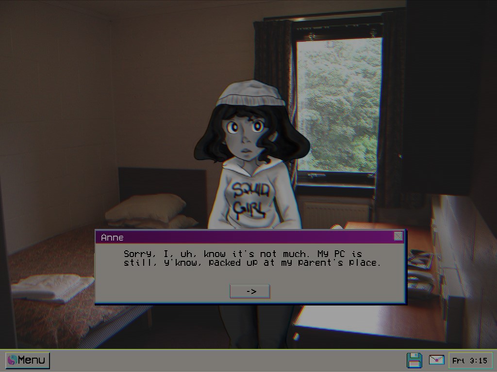
An early Anne screenshot... yes, this is who's been texting you in l33tspeak.
This demo for Don’t Take It Personally was also very simple in structure: you’d sit through a sort of “freshman orientation” class (the kind that most colleges run first semester that basically just tries to convince you that you need to eat some vegetables and exercise every now and then), then you’d be lead through the campus to meet the extended cast of characters. First, you’d grab lunch with Sarah, who tells you about an upcoming school formal dance that she, as a member of student council, expects you to attend, and then you would go do homework in the lab with your friend Charlie, attend a party with your roommate Todd and his crush Dale, etc. This would end once you’d been taken through a quick, five-minute vignette with every major character. Then, Todd would remind you of your promise to go to the dance Sarah had planned and bring a date, and you’d get two days where you could pick one of the girls to hang out with before making your decision. And then the game would end, thanking the player for their time and asking them to stay tuned for updates. All in all, very standard, and very boring.
There was no drama or room for any real character conflict, just the foreshadowing of future drama and the promise of conflict at a later date. None of what I felt were the story’s strengths were on display here, instead it’s just a quick round of the name game, with the only really hook I had been the hope that these characters were endearing enough to keep players interested. And while I have faith in these characters and, more importantly, my own skills at writing believable, witty dialogue, the whole thing didn’t feel like it had much that would draw people in and even less that would make them stay.
One other thing that made me unsure of this particular demo was that this was all still relatively early in my writing process, and I didn’t quite have a full grasp on these characters yet. While some of them had arcs that were nearly fully fleshed out and outlined, a few mostly just existed as a list of themes and character tropes I thought might be fun to play around with. As such, this early script has a lot of characters acting differently from the way they’re currently written. I could write an entire article about how and why each character has changed over development (and I probably will at some point), but in the interest of time I’ll just talk about the two characters I focused on in the final demo.
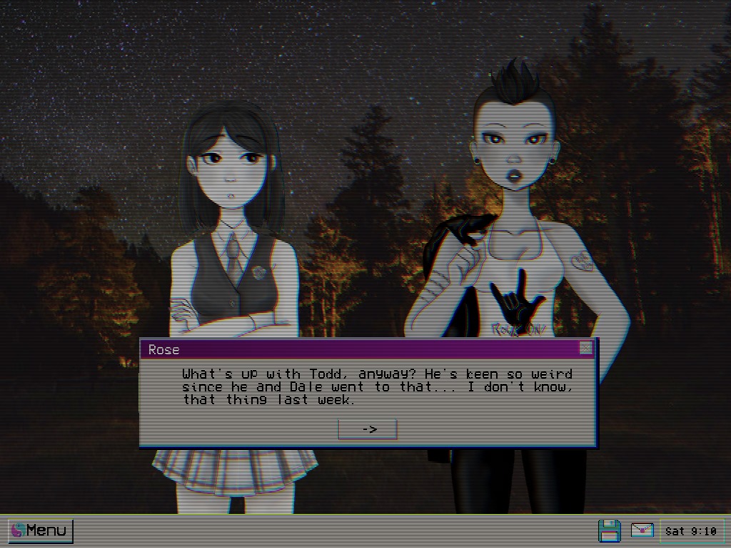
I really don't like this old UI. Making the textboxes semi-transparent was one of the best ideas from version three.
Rose is one of the characters who’s undergone the least change between drafts. Since I started the game in earnest, I had a strong idea of what I was doing with her (she was the second character to have an outline, after Sarah), and the overall themes and personality traits I wanted to use in her route have stayed consistent. However, there are two story elements that played an important role in this demo that I later changed. The first was that she was the RA of the protagonist’s dorm, which was how they met, and the second was that she had just recently gotten out of a long-term relationship and had been blindsided by the breakup.
Her role as an RA was changed to her being part of student council, a trait that I took away from Sarah because there was no real point in having more than one person in a student government-adjacent role. Also, it meant she had a position of authority over the player character, and this raised questions I had no intention of answering. I dropped the ex-partner plotline even earlier, due to the fact that I didn’t have any plans for them to play any role or pay off in any meaningful way. Rose does occasionally make references to an ex in the final script, but with no indication that the breakup was recent or particularly sudden. I like to think of it as just a bit of character background rather than as a story hook.
On the opposite end of the spectrum we have Maria. She wasn’t even in the original draft. The fifth character slot was taken by Charlie, who I mentioned four paragraphs prior. Charlie was an art student who worked as a barista near the college campus, and outside of a bit of backstory, that’s about as far as I ever got with her. She was such a boring character to write, the only way I could ever remember the name was by the coincidence that she shared it with a character from one of my favorite movies. There were some ideas I had for her, all those ideas and interesting traits cannibalized to add depth to the others. Mysterious backstory? Maria. In a study group with the protagonist for a class neither is getting good grades in? Anne. Bilingual? Split between Sarah (who speaks Cantonese to her parents and slips in some slang from now and then) and Dale (who is trying to learn a new language but can’t decide on which one).
Overall, there are ideas that I like about this layout, and I might revisit it in some fashion later on (my demo’s a little too long for tradeshows, but I might revisit the date-selection portion in some revised fashion). Still, I got a lot out of this exercise, and it did help me to get a better handle on how certain characters were written, which to me makes it a valuable use of my time. Which is more than I can say for…
Demo 2: The Mechanical Focus
I’m going to keep this brief, because this demo was a massive waste of time, barely ran, and I genuinely consider containing some of my worst writing. It’s a month and a half of development time I’ll never get back, and nothing I made during this time, with the exception of a few backgrounds, will ever be used in future sections of the game.
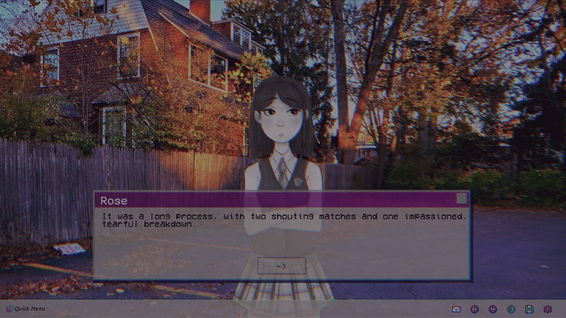
Here, Rose accurately describes me trying to make version two run.
In the past few years, a number of game demos came out that, rather than just be a random early section of the game, instead were there own slices of content that didn’t appear in the game proper. They kept a tight focus tightly on mechanics and atmosphere, while offering just enough clues about the product to drive speculation. A good example would be the Resident Evil VII playable teaser, which was made entirely of assets from the main game (including a digression inside a video tape and a particularly memetic voice line/animation that appear unaltered, albeit in a slightly different context) but was it’s own self-contained adventure.
The goal for this was to be a small level built around the game’s conversation system, which is designed differently from a lot of other dating sims. Rather than be objective or point based (i.e. how often you agree with or do things that directly benefit the person you’re pursuing determines how much they like you) it’s based on how you pick up on small details, what you do with that information, and how well you can keep a conversation going. So the plan was to focus on that, in a small, self-contained environment (in this case, a date to a mall) with a single character (Rose, who I was, at that time the character I was determined to make the face of the game).
While I still think that system works, it really does not gel with the compressed timeline offered by a demo. It’s one thing to remember that character a’s favorite flowers are poinsettias an hour and a half later after you’ve been told and determine that they would appreciate if you point out a display of them, or that they don’t really like scary movies and would like it if you steered the conversation away from the topic at a party later so they don’t have to talk about it. It’s another to have someone tell you their favorite drink and then, five minutes later, you’re presented with a choice of which soda to give them. It felt awkward and stilted, the exact thing this system of dialogue was designed to avoid, like having someone read you the answers to a quiz minutes before you take it.
The other reason I found it underwhelming is, again, there was no real drama other than a date that (player choice depending) may go poorly. I didn’t want to give away the game by focusing on any of the real conflict found in Rose’s main game route, so I had to invent something that to go wrong, and what I came up with (a stress-induced panic attack) felt sorely lacking as a dramatic end. It was far from an interesting experience, and any attempts I made to force more conflict into the situation felt either out of character for Rose or would require me to unfairly railroad the players.
All in all, this approach did not work for what I was trying to accomplish, and nearly killed all motivation I had to work on this project. I’d write conversations between Rose and the player, then come back a day later and feel the urge to rewrite everything because I knew it just felt wrong. After a while, I started to wonder if maybe I was just going to have to try something radically different. Then, once I finally made the decision to post publicly online about the game, I knew exactly what I had to do.
Demo 3: Tell a Story
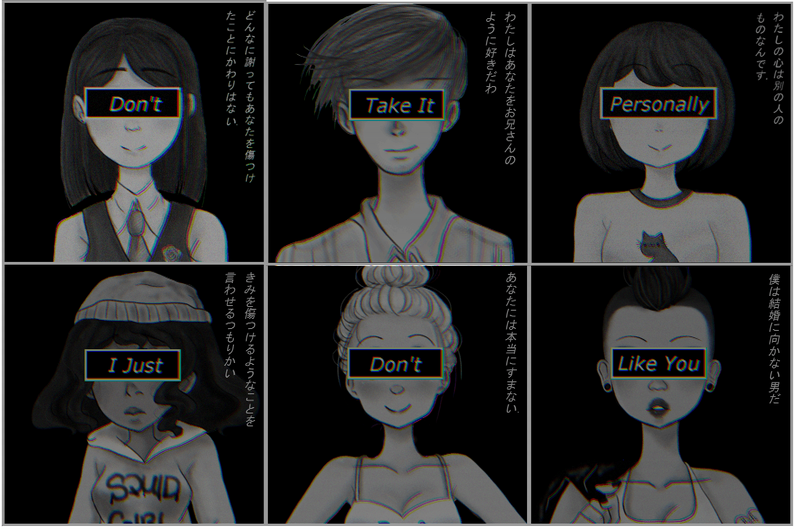
In the end of August, I was going to a concert and I knew I had to put something, anything, out for this game. I had wanted a demo out by July, and the fact that I’d, at that point, all but totally scrapped what I was previously working on meant that I needed to do something quickly. So I, with the help of Ashley, the very talented character artist who designed all the game’s characters, made six teaser images of the game’s characters. This included one for Maria, who I drafted up a basic description of at basically the last minute to replace Charlie, because if I couldn’t make myself care about her than I knew no audience would. I also made a few super basic screenshots in engine to give an idea of what the game would look like.
It was a bigger success online than I had expected. Really, anything was a bigger success than what I’d expected. I got a lot of good attention, including from a few publishers, and as I shared more pictures it only increased. Not only that, but posting different teasers allowed me to get an idea of which characters people liked and identified with, with Rose and Maria taking the top spots. I can’t say I’m surprised Rose was popular, as I’d pictured her as being the ‘face’ character for the game, but Maria, a character who I had pulled out of nowhere in a desperate attempt to fill out a roster, took me by surprise. So, obviously, I had to use those characters.
(Also, a small piece of advice for anyone who wants to make a dating sim: at some point, someone will tell you, point blank, that they want to have sex with one or more of the characters, and that you should include a scene where that happens. For me, the first time this happened was after I finished the full character reveal. I do not know what the appropriate response to this is, so if anyone figures it out please let me know.)
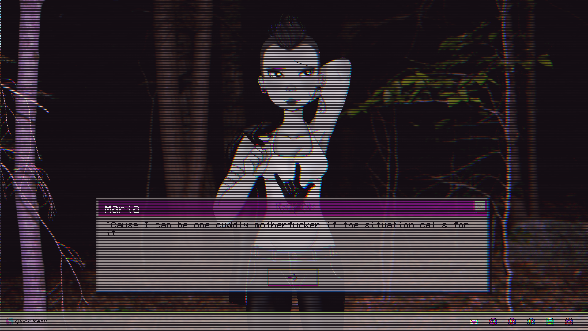
This one's for you, first person who made me realize the truth of working on a dating sim.
The situation I put them in came naturally from there. I have access to a wooded area with a lot of good trails, so… I guess they’re going camping? Maria definitely knows what she’s doing in the woods, but Rose would be a complete newbie, maybe that could be a source of conflict? Oh, and I want to at least mention some of the other characters, so a cellphone/texting mechanic and a subplot about Todd’s poor decision making and love life would accomplish most of that.
Obviously, the conversation mechanics I’d intended to use didn’t work in the compressed timeline, so I focused on just creating natural sounding conversations with little to no mechanical penalty. Instead, if you steer the conversation in an awkward or uncomfortable direction, the characters will just… react like you said something awkward, and the conversation will move on like normal. This isn’t exactly how I want this system to work in the full game, but it fits better into this project. Also, the static effect was something I intended to function more like a life bar, intensifying when the player makes bad decisions, but having it activate in scripted scenes regardless of the player’s choices was a good way to demonstrate the effect here.
The only real problems I ran into was the scope of the project, which expanded farther than I anticipated. I had hoped for thirty pages of script, or the length of a TV episode. What I got was instead around ninety pages long, much bigger than I had thought. However, I think it’s the right size for this demo. It’s short, but introduces plot points in a timely fashion, with plenty of time for the player to get to know the characters.
One thing I didn’t count on was how much people would like Todd and want to help him. I had to make it much clearer that going to help Todd would end the demo early, something that I did by putting in a small warning when you go to help him and asking the player to confirm their choice. Also, I hope that writing that the game had four endings on the downloads page gave them more reason to try the other options as well.
The other bit of advice I would give to any would be indie developers: testing will take you at least two weeks. I had what I believed to be a finished demo around Thanksgiving and didn’t actually get it out until just before Christmas. Part of this was simple stuff (typos, a few sneaky things with pronouns, etc.) but there was at least one point where larger parts of the game had to be tweaked. For example, one song had to be remastered, because it had a few spoken word sections that started to grate after it looped through a few times. There was also a Very Special Scene in Maria’s route that I redesigned, rewrote, and reprogramed almost completely after the one person to trigger it got so frustrated, he ended his playtest right there. So, glad we caught that.
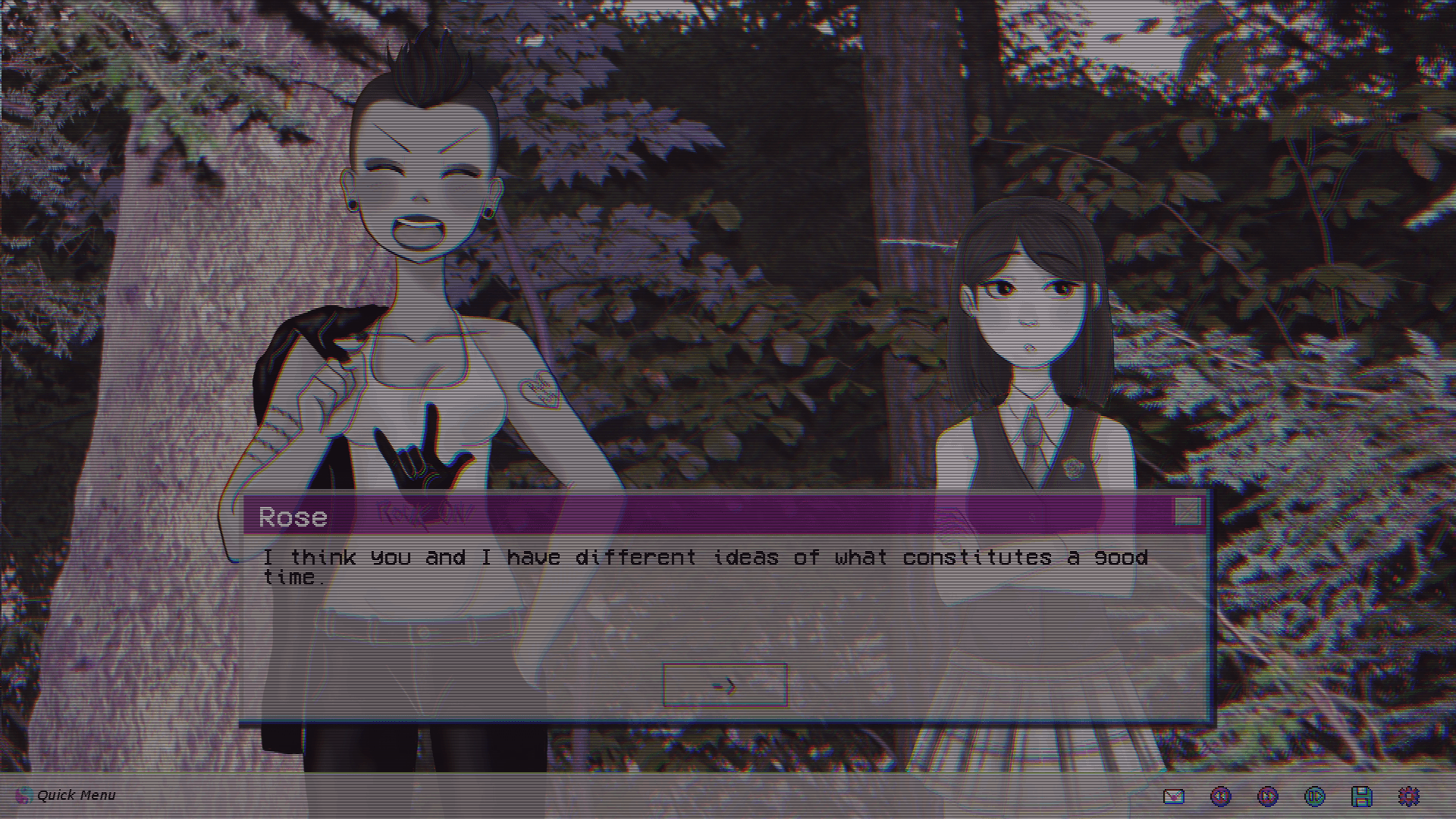
I had a great time working on this project, and I can't wait to share more with you!
The other thing I’ll say, equally important, is that your download page must look professional. Ours, at launch, wasn’t because I had a feeling of just get it out there, and I do genuinely believe this cost us some downloads in the first few days. Still, it’s been a very successful launch, and I’m happy to have seen the response to the game both on and off this platform. I can’t wait to keep working on Don’t Take It Personally, and I can’t wait to show you some more!
-Christian DeCoster
Files
Get Don't Take It Personally, I Just Don't Like You: The Camping Trip
Don't Take It Personally, I Just Don't Like You: The Camping Trip
the lo-fi anime dating sim to cry to
| Status | In development |
| Author | DeCoster |
| Genre | Visual Novel |
| Tags | Anime, Dating Sim, Kickstarter, LGBT, Lo-fi, Meaningful Choices, Ren'Py, Retro, Spooky |
| Languages | English |
| Accessibility | Color-blind friendly, Subtitles, One button |
More posts
- Don't Take It Personally, I Just Don't Like You launches tomorrow!Apr 27, 2023
- Full game launching April 28th!Apr 08, 2023
- Soundtrack to the full game on Spotify!Jul 23, 2021
- We're on Kickstarter!Jul 28, 2020
- A New Trailer and KickstartetJul 03, 2020
- Updates and DiscordJun 10, 2020
- A Few Quick FixesJun 06, 2020
- Thanks!Dec 23, 2019
Leave a comment
Log in with itch.io to leave a comment.